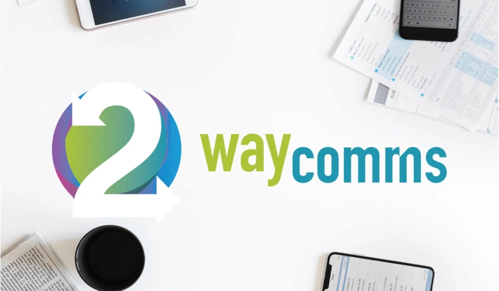
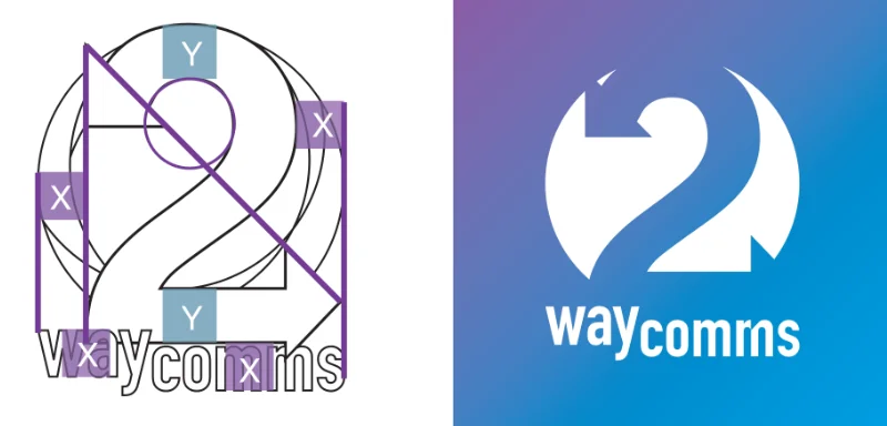
2waycomms needed a brand identity that captured the essence of its name: communication that flows both ways. I developed a logomark that transforms the numeral “2” into a pair of interlocking arrows, symbolizing dialogue, feedback, and connection, paired with a bold, friendly wordmark that feels modern and approachable.
The core idea behind the identity was reciprocity. Rather than a static, one-directional symbol, the logo needed to suggest movement and exchange, information going out and coming back. The two arrows curving around the numeral “2” do exactly that, while the gradient shift from purple to teal to green adds depth and energy without feeling overly technical or corporate.
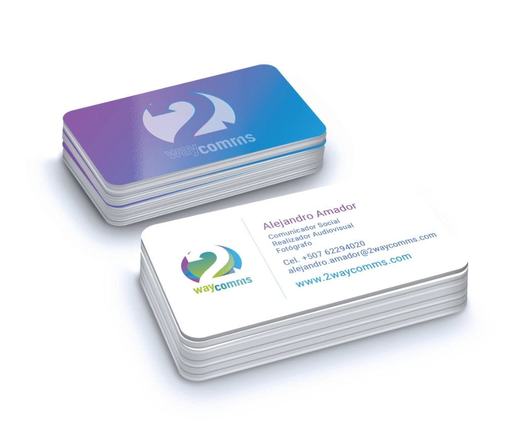
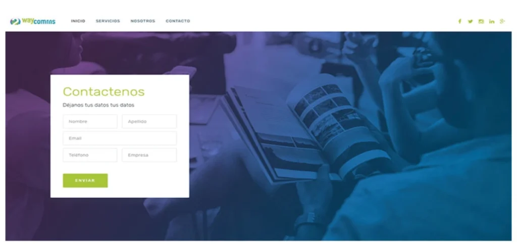
The palette and typography were built to feel versatile across both digital and print touchpoints, from business cards and letterheads to app interfaces and marketing materials. The rounded, lowercase wordmark keeps the brand approachable, while the vibrant color transitions in the mark give it enough visual interest to stand alone as an icon, whether on a phone screen, a printed report, or signage.